Discover A Pet
I developed an app called "Discover A Pet" using Figma. I began by conducting thorough market research, including a competitive analysis where I performed a heuristic evaluation of Petfinder.com. Following this, I interviewed my target demographic, which informed the creation of an empathy map and a persona. I then designed a user flow and created low- and mid-fidelity prototypes in Figma. To validate my designs, I crafted a script for usability testing with real users. Based on the feedback, I iterated on the design and refined it, leading to the final version of the app.
Experience Title: Facilitating Pet Adoption: Connecting People with Their Perfect Companions
Summary:
Our app serves as a dedicated platform for individuals seeking a new pet, available 24/7 in Everett and Woodinville. By showcasing a variety of pets, we aim to facilitate meaningful connections between users and their ideal companions.
User Goal:
Users aim to utilize filters to swipe through available options and identify the perfect match for them in a pet.
Business Goal:
Our objective is to ensure that the right demographic encounters and ultimately adopts a pet that aligns with their long-term needs and lifestyle.
Constraints:
We prioritize a cost-effective solution to avoid significant financial strain on shelter operations. Additionally, we strive for a user-friendly and intuitive platform that keeps prospective adopters engaged and encourages return usage.
Market Analysis Experience Model
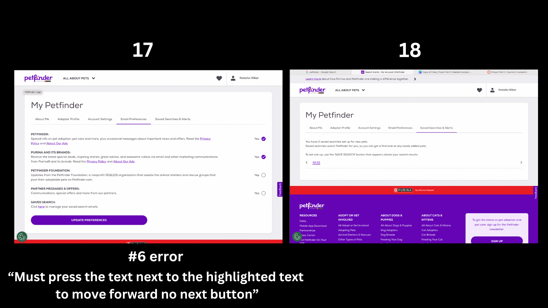
Competitor Heuristic Evauluation
Interviews / Empathy Map / Persona
Ideation & Sketching
Low Fidelity Mockup
Mid Fidelity Mockup
Findings from User Testing
I created a script to run through and found some test subjects to run through my app. I have included a copy of this interview script. I recorded myself running a participant through the application, using my interview questions, and noted his feedback.
High Fidelity
Originally, I wanted the app to include a Tinder-like swiping element, but based on recommendations from my testers, I redesigned the home page to display multiple pets at once. I also added a feature to like pets that users find interesting for easy identification later. However, I couldn't find a way to allow multiple pets to be liked simultaneously on the home page.
I increased the text size throughout the app and removed the page with more detailed information about each pet. Instead, I moved the contact button directly to the pet listing itself. I made the navigation bar fixed at the base of each listing and made the screen scrollable.
To provide a more realistic experience, I added more pets to choose from, increasing the total number of screens by a dozen. I also significantly reduced the amount of text in the “success” message after the contact page.
Conclusion
What worked best in this project was starting with a general approach and then recognizing and challenging my biases and assumptions. By involving users and gathering data, I could test and refine my ideas. Interviewing people to derive qualitative data was invaluable for understanding the needs and wants of my target audience.
Testing low and mid-fidelity versions with participants significantly impacted my design, moving away from the Tinder-like interface. This process also helped me identify and address accessibility issues, such as illegible font sizes and excessive text, and provided the foresight to trim unnecessary screens.
For further development, I would create a separate section exclusively for favorited pets. Additionally, I would explore creating a pre-adoption screening process with digital paperwork, which could be verified by shelter staff or AI, allowing participants to book meetings with their preferred pets.


